
Mimoo Baby
A Baby-Shower Gifting Platform, Designed and Built
Mimoo Baby is a baby-shower gifting platform. Expectant parents create their own personalized page, and friends and family purchase symbolic, hand-illustrated "gifts". The parents then receive the cash equivalent, free to buy what they truly need. I designed the brand and the product, then wrote the software that runs it: account types with different permissions, Google and Facebook sign-on, and a checkout that credits the right parents' page on its own.
Project Goals
- ✓ Design a sensitive and trustworthy brand identity.
- ✓ Create a seamless, intuitive user experience.
- ✓ Build the accounts, sign-on and payment logic a real platform needs.
Challenges & Solutions
Elevating the Guest Experience
The platform needed to transform a simple transaction into a meaningful act of giving. By focusing on a beautiful, personalized registry page that tells the mother's story and using charming illustrations as symbolic gifts, we created an emotional and memorable connection.
Choosing What to Build On
A pre-launch business does not yet know whether it will still exist in a year, so the platform had to be cheap to run and possible for someone else to take over. Building it as a custom application would have cost several times more and left the founders with a codebase they could not staff. WordPress and WooCommerce handle the parts that are already solved, and I wrote the rest in PHP.
What I Built
The gifting model does not exist off the shelf, so the logic behind it is custom. None of the following came from a plugin.
Accounts and Permissions
Expectant parents and their guests need different things from the platform, so the site runs several account types with their own permissions, each seeing only what belongs to them.
Google and Facebook Sign-On
Guests arrive once, often on a phone, to buy a single gift. Social sign-on removes the registration step that would otherwise lose them. Written as custom PHP against each provider rather than installed as a plugin.
Purchase to Account
A guest checks out through WooCommerce and the payment has to reach the right parents' page, credited to the right total, with nobody reconciling it by hand. Connecting the order to the account is the part the business actually runs on.
Built to Be Handed Over
Custom PHP and MySQL, kept modular so a feature can be added without unpicking the rest, version controlled in git, and documented for whoever works on it next.
Design System Examples
Usage Guidelines
Input fields are designed to be clean and calm. They feature a soft border radius and a subtle color. On focus, the border changes to the secondary purple, providing a clear but gentle indication of the active field.


Usage Guidelines
Social media icons are custom-designed to match the brand's gentle aesthetic. The hover state reveals a filled version, providing a delightful and clear interaction.



Usage Guidelines
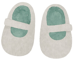
Watercolor illustrations are a core part of the brand. They represent symbolic gifts, adding a touch of whimsy, warmth, and handcrafted charm to the cash-fund experience.
Body and paragraph copy.
Usage Guidelines
All headings use 'Comfortaa' for a soft, rounded, and approachable feel. Body copy is set in 'Rubik' for optimal readability. H6 is styled for use as an accent label.
Usage Guidelines
The color palette is warm, gentle, and earthy. The Main Green establishes calm, the Secondary Purple is used for actions, and an Accent Gold provides a hint of celebration.
Digital Presence & Platform UI
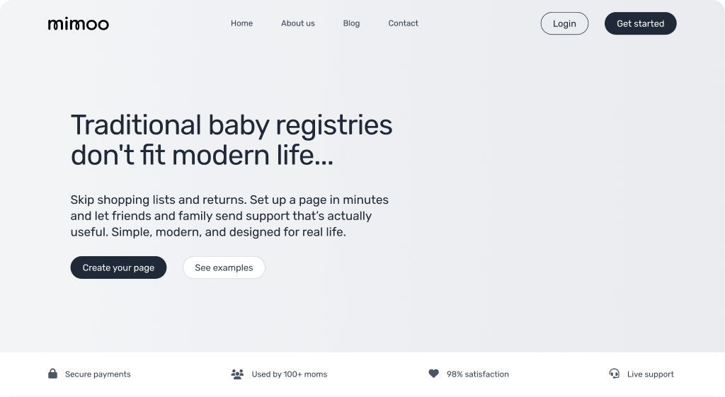
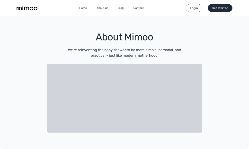
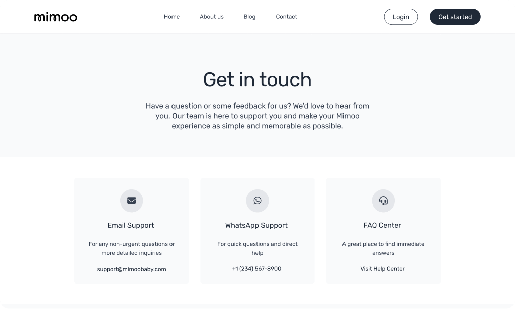
The brand identity and UI/UX design were translated into a high-fidelity, interactive prototype and a live WordPress MVP, ensuring a seamless journey from start to finish.
Project Outcomes
Cohesive Brand Identity
Delivered a comprehensive brand strategy and identity system that captures the brand's timeless essence.
A Working Platform, Launched
Live and taking real payments, with accounts, sign-on and gifting logic written from scratch, on a stack the founders can afford to run and hand to someone else.
User-Centric Design
Created a flexible design system that ensures brand consistency and prioritizes a simple, intuitive user experience.