ALAND Home Loans
Confident, Trustworthy, and Clear
This project involved creating a new brand identity and digital experience for ALAND Home Loans. The primary challenge was to position the brand as confident and trustworthy, appealing to a diverse audience including first-time buyers and new investors. The design needed to feel stable and professional while remaining friendly and accessible, simplifying the complex journey of home ownership.
Project Goals
- ✓ Develop a trustworthy brand identity that feels stable yet accessible.
- ✓ Design a clear, intuitive, and easy-to-navigate user interface.
- ✓ Establish a supportive, jargon-free brand voice to reassure users.
Design System Examples
Usage Guidelines
- Clear Space: The minimum clear space is defined by the height of the “A” in ALAND.
- Minimum Size: For digital use, the logo should be at least 120px wide.
- Backgrounds: Never place the logo on busy or low-contrast backgrounds.
"Our goal is to guide people through one of life’s biggest decisions without overwhelming them. We’re here to simplify home ownership and show people that it’s within reach."
The Brand Voice
The tone is clear, supportive, and grounded. We speak with confidence, but never with arrogance, using language that is approachable, practical, and reassuring. We write honestly and helpfully, without unnecessary jargon.
Satoshi Light
Satoshi Medium
Satoshi Bold
Usage Guidelines
The chosen typeface is Satoshi, a clean, modern sans-serif that balances professionalism with approachability. Its geometric structure gives it a quiet confidence, ideal for conveying clarity, trust, and stability.
Usage Guidelines
The palette is warm, modern, and approachable. For digital body text, #1E1E1E is used to ensure strong contrast and readability while being softer than pure black.
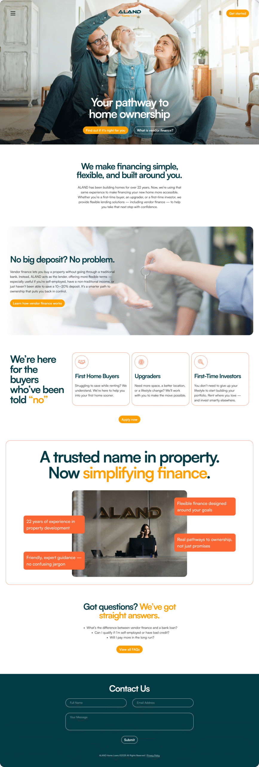
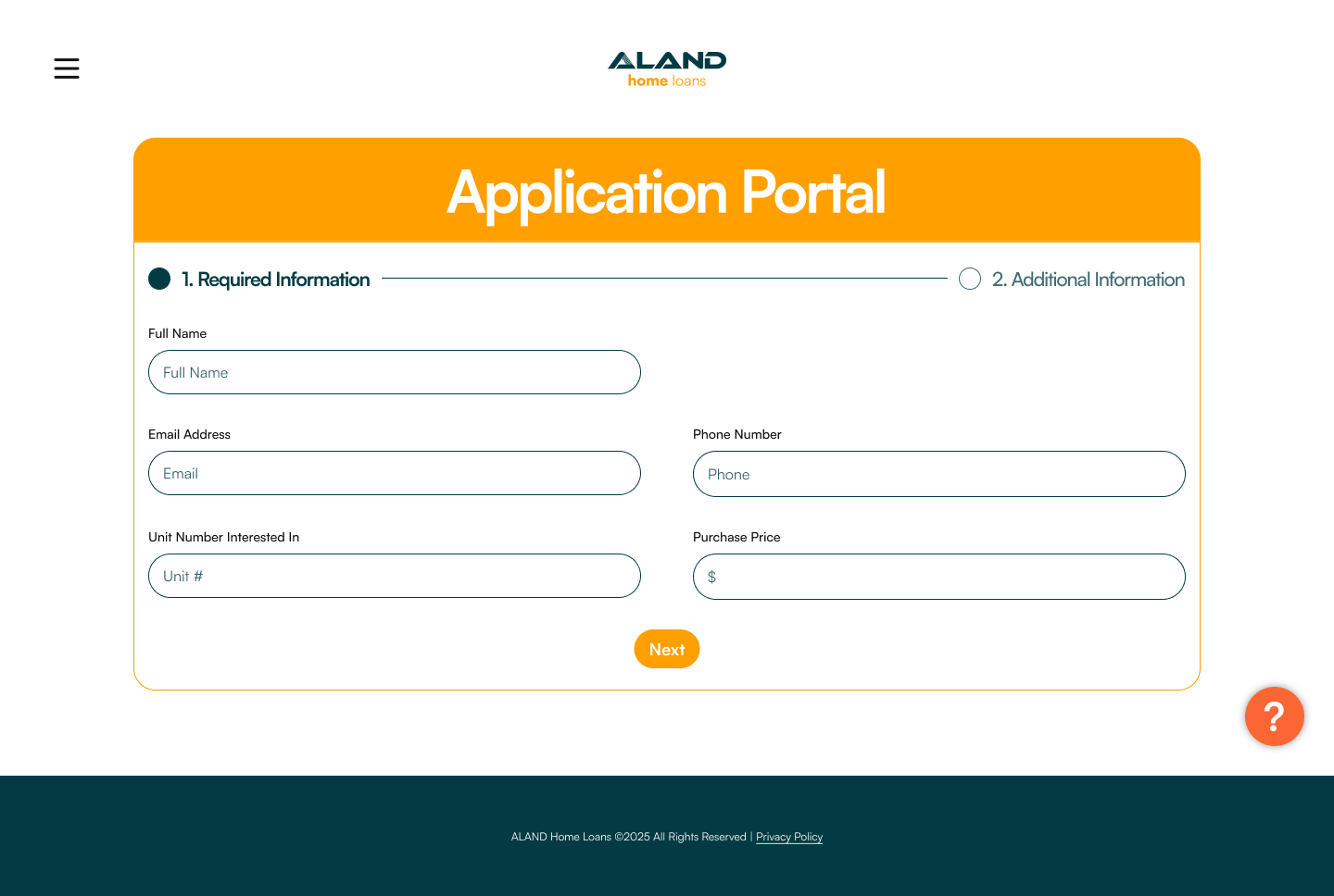
Digital Presence & Platform UI
The brand system was translated into high-fidelity prototypes for the main marketing website and key user flows within the digital platform. The focus was on creating a seamless and reliable journey for the user, reinforcing the brand's promise of clarity and support at every step.
Project Outcomes
Cohesive Brand Identity
The new system successfully positioned ALAND as a trustworthy and approachable leader across all digital and print touchpoints.
Enhanced User Clarity
The user-centric interface and jargon-free copy created a more intuitive experience, leading to increased engagement and confidence.
Strong Market Positioning
The final brand identity provided a strong foundation for marketing, effectively communicating ALAND's unique value proposition.