Mimoo Baby
A Gentle, Flexible Approach to Baby Registries
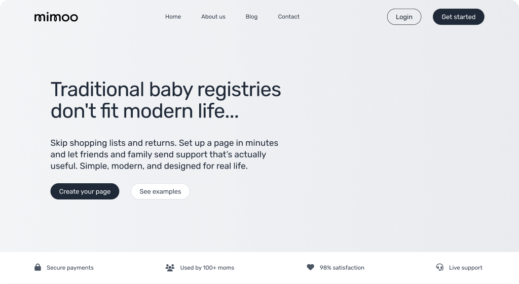
Mimoo Baby is a startup platform designed to revolutionize the baby registry experience. Moving away from traditional gift-giving, Mimoo allows expectant mothers to create beautiful, personalized registry pages where friends and family can contribute to a cash fund. Guests purchase symbolic, beautifully illustrated "gifts," and the mother receives the cash equivalent, giving her the flexibility to buy what she truly needs.
Project Goals
- Design a sensitive and trustworthy brand identity.
- Create a seamless, intuitive user experience.
- Develop a fully functional and scalable MVP on WordPress.
Challenges & Solutions
Elevating the Guest Experience
The platform needed to transform a simple transaction into a meaningful act of giving. By focusing on a beautiful, personalized registry page that tells the mother's story and using charming illustrations as symbolic gifts, we created an emotional and memorable connection.
Building a Scalable MVP
The challenge was to build a user-friendly MVP that was also a solid foundation for future growth. A modular development strategy using custom PHP functions created a lightweight yet robust platform, ensuring new features can be added with minimal friction.
Design System Examples
Usage Guidelines
Input fields are designed to be clean and calm. They feature a soft border radius and a subtle color. On focus, the border changes to the secondary purple, providing a clear but gentle indication of the active field.
Usage Guidelines
Social media icons are custom-designed to match the brand's gentle aesthetic. The hover state reveals a filled version, providing a delightful and clear interaction.


Usage Guidelines
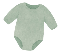
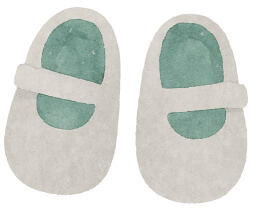
Watercolor illustrations are a core part of the brand. They represent symbolic gifts, adding a touch of whimsy, warmth, and handcrafted charm to the cash-fund experience.
Heading 1
Heading 2
Label
Body and paragraph copy.
Usage Guidelines
All headings use 'Comfortaa' for a soft, rounded, and approachable feel. Body copy is set in 'Rubik' for optimal readability. H6 is styled for use as an accent label.
Usage Guidelines
The color palette is warm, gentle, and earthy. The Main Green establishes calm, the Secondary Purple is used for actions, and an Accent Gold provides a hint of celebration.
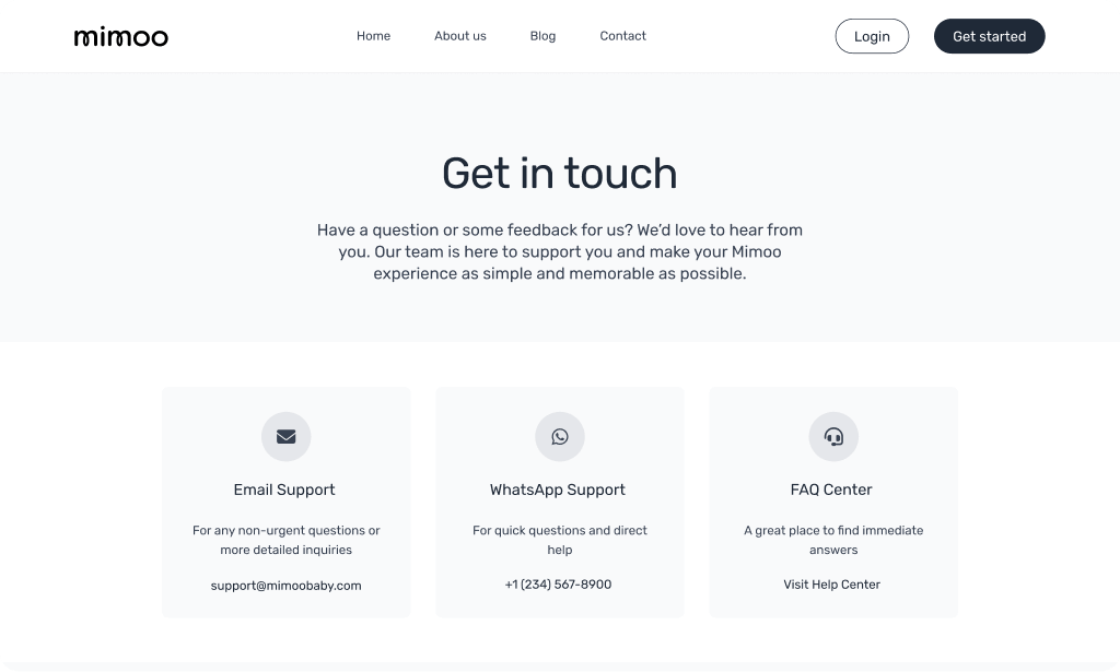
Digital Presence & Platform UI
The brand identity and UI/UX design were translated into a high-fidelity, interactive prototype and a live WordPress MVP, ensuring a seamless journey from start to finish.
Project Outcomes
Cohesive Brand Identity
Delivered a comprehensive brand strategy and identity system that captures the brand's timeless essence.
Functional MVP Launch
Designed and developed a functional MVP on WordPress, providing a solid, scalable foundation for launch.
User-Centric Design
Created a flexible design system that ensures brand consistency and prioritizes a simple, intuitive user experience.