Swiftic.com
Making Mobile Marketing Accessible to All
Swiftic was a Software-as-a-Service (SaaS) platform that empowered small and medium-sized businesses (SMBs) to create their own custom mobile apps without any coding knowledge. The platform's core mission was to make mobile marketing and customer loyalty accessible and affordable for everyone, providing an easy-to-use, fast, and effective solution.
Project Goals
- ✓ Simplify app creation for non-technical users.
- ✓ Design a clean, intuitive, and trustworthy UI.
- ✓ Increase user conversion from trial to paid.
Challenges & Solutions
Consolidating Disparate Systems
The project began with multiple, inconsistent design systems. I conducted a comprehensive audit of all existing styles and unified them into a single, cohesive design system, establishing a solid foundation for the platform's revamp.
Managing a Large-Scale System Solo
As the sole designer, the sheer volume of components and states was a logistical challenge. I developed a highly organized, systematic approach to component creation, focusing on scalability and reusability to efficiently build and manage the entire system.
Design System Examples
Usage Guidelines
Form elements are sharp and functional. Dashed placeholders are used for media uploads. Error states are clearly communicated with a red border and helper message.
Usage Guidelines
Icons use a consistent solid-fill style and the brand's primary blue to communicate concepts quickly, contributing to the platform's ease of use.
Heading 1
Heading 2
Heading 3
Body copy is set in Lato for its warm, friendly, and highly legible characteristics.
Usage Guidelines
The typographic scale is designed for maximum clarity, with all headings set in Lato Bold or Black. The line height is 150% for readability.
Usage Guidelines
The palette is built around an energetic Blue (#4EA5FF) and a vibrant Yellow (#FCBF1E) for highlights, supported by clear colors for error and success states.
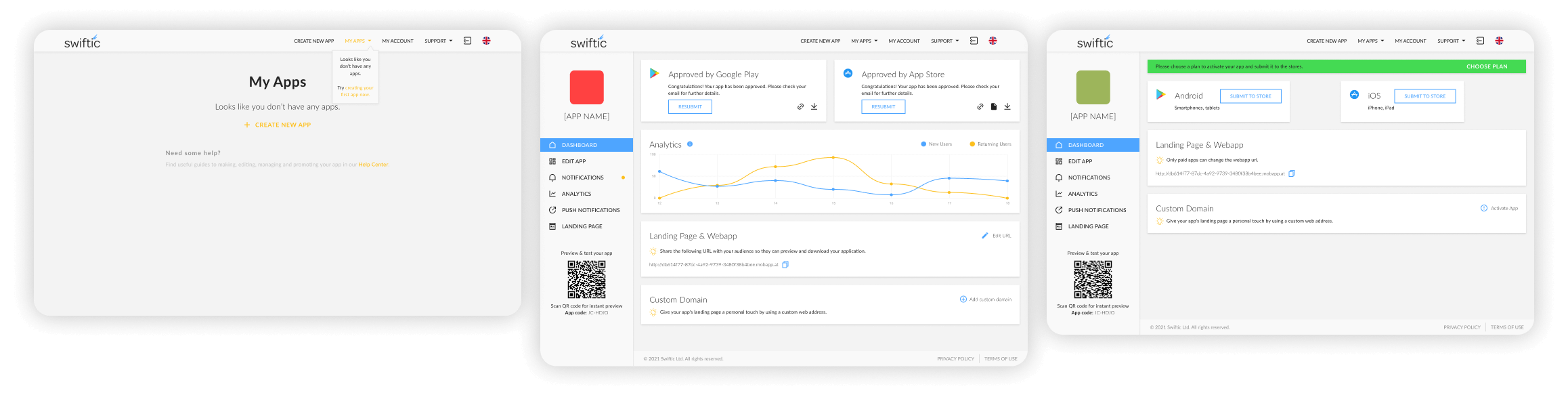
Digital Presence & Platform UI
The final designs were translated into a high-fidelity prototype of the main marketing website and key user flows within the app-building platform itself. The focus was on a seamless journey, from the initial landing page visit to the final step of publishing a new mobile app.
Project Outcomes
Improved User Experience
The redesigned UI and streamlined user flows led to a significant decrease in support tickets and an increase in positive user feedback.
Increased Conversion
A clearer value proposition and more intuitive onboarding contributed to a measurable lift in free trial sign-ups and paid conversions.
Successful Acquisition
The platform's strong market position and polished UX culminated in its successful acquisition, a testament to user-centered design creating tangible business value.